
Brand: Tradesman Nutrition | Project: Full Store Redesign | Result: $8K–$10K revenue per day at 3.5–4.5% conversion rate
The Problem: A Great Product Stuck Behind a Weak Store
When Tradesman Nutrition first came to Hi Ecom, they had something most brands spend years trying to build: a product their audience genuinely loved. Strong reviews. Real word-of-mouth. A loyal customer base in a competitive niche.
But their Shopify store was holding them back. It did not reflect the quality of what was inside the tub. The design felt dated, the mobile experience was clunky, and there was no clear conversion logic guiding visitors from landing to checkout.
Traffic was coming in. Money was leaking out.
The Brief
Tradesman Nutrition came to us with a clear objective: build a store that sells as hard as the product does. They did not want a prettier version of what they had. They wanted a complete rethink — one built around how their customers actually shop.
Key goals included:
- Dramatically improve mobile experience (their traffic was 74% mobile)
- Increase conversion rate from under 1.5% to industry-leading levels
- Communicate value, trust and brand identity from the first scroll
- Streamline checkout to reduce abandonment
Our Approach

1. Mobile-First Design, Not Mobile-Adapted
We started every design decision on a 375px screen. Not on a MacBook. This sounds simple but it changes everything — typography scales differently, CTAs sit at thumb-height, and image layout is completely rethought. The desktop version was built from the mobile, not the other way around.
2. Clear Value Proposition Above the Fold
The new homepage hero led with a specific, benefit-driven headline paired with social proof (verified review count + star rating) visible before the first scroll. No vague taglines. No stock photography of people running. Real product. Real numbers.
3. Conversion-Engineered Product Pages
Each product page was rebuilt around a proven framework: attention → desire → trust → action. We added ingredient transparency sections, photo reviews, a money-back guarantee badge, a sticky Add-to-Cart bar on mobile, and a subscription offer with clear savings displayed.
4. Checkout Overhaul
We enabled Shop Pay, Apple Pay and Google Pay. Removed forced account creation. Added a progress indicator to the checkout flow. Made free shipping thresholds visible in the cart. Each of these changes alone typically lifts completion rates by 5–12%.
The Results
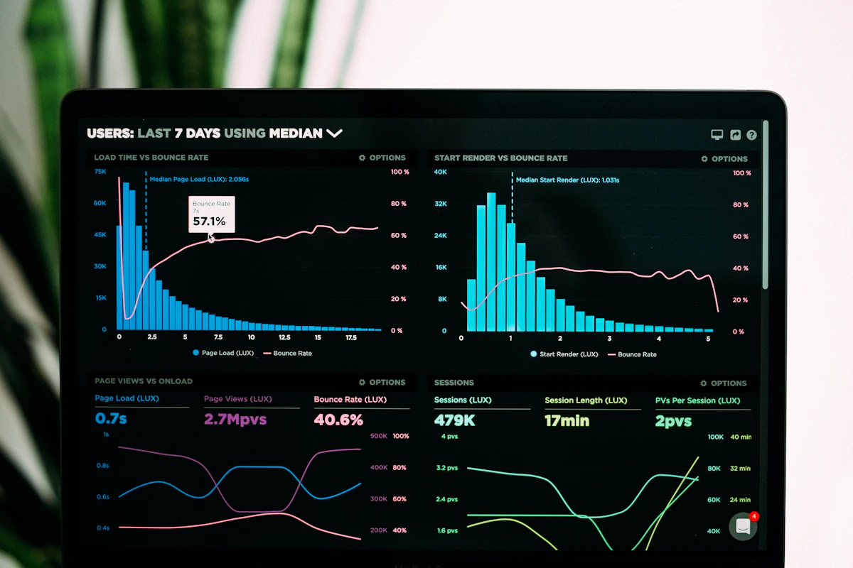
Within weeks of launch, the numbers spoke for themselves:
- 📈 Conversion rate: 3.5–4.5% (up from under 1.5%)
- 💰 $8K–$10K revenue per day
- 📱 Mobile conversion rate tripled
- ⭐ Cart abandonment rate dropped significantly
“Super happy with the conversion rate — it has a healthy ROAS too! We credit this to the awesome work Yusif and his team did on the website.”
— Tom B., Tradesman Nutrition
The Lesson
A great product deserves a great store. If your Shopify site is not converting at 2.5% or above, it is not a traffic problem — it is a store problem. And store problems are solvable.
The gap between a 1.2% and a 4% conversion rate on the same traffic is not small. At 10,000 monthly visitors with a £60 AOV, that is the difference between £7,200 and £24,000 per month in revenue. From the same ad spend.
Could Your Store Get Similar Results?
Every brand is different, but the underlying principles — mobile-first design, trust signals, reduced friction, clear value communication — work across the lifestyle and wellness niche consistently.
If you want to find out exactly what is holding your store back, book a free 20-minute audit. I will review your store live, tell you what I see, and be honest about what it would take to fix it.